Arrmet’s new identity has been created by paying tribute to the bond with the Company’s recent past and recovering 50s and 60s Italian visual culture. This was a period in history when many companies in the furniture sector promoted modern graphics, with the co-operation of illuminated architects and graphic designers from that period.
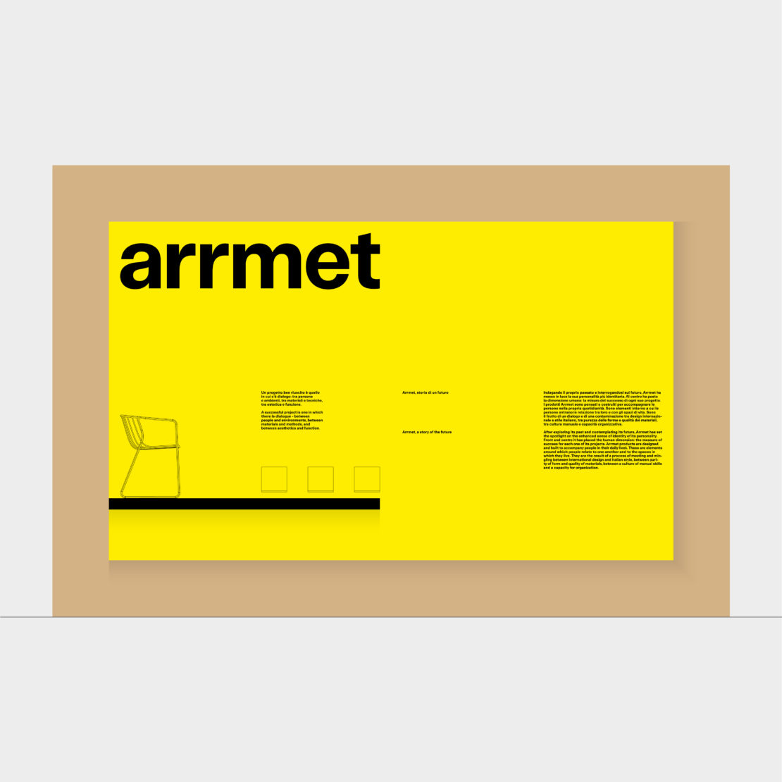
For the 2021 Milan Furniture Fair, the designer chair and table company is unveiling its new logotype and the Arrmet Grotesk typeface. It is a custom version of the FT Aktual font, designed by Alberto Moreu and Alberto Malossi.
“We sought to associate our logotype, which is identified by a typeface based on geometric shapes, with a more italic and Mediterranean style. While remaining clean-cut and modern, the logo has taken on a more humanistic design, which fully embodies the Company’s personality.”
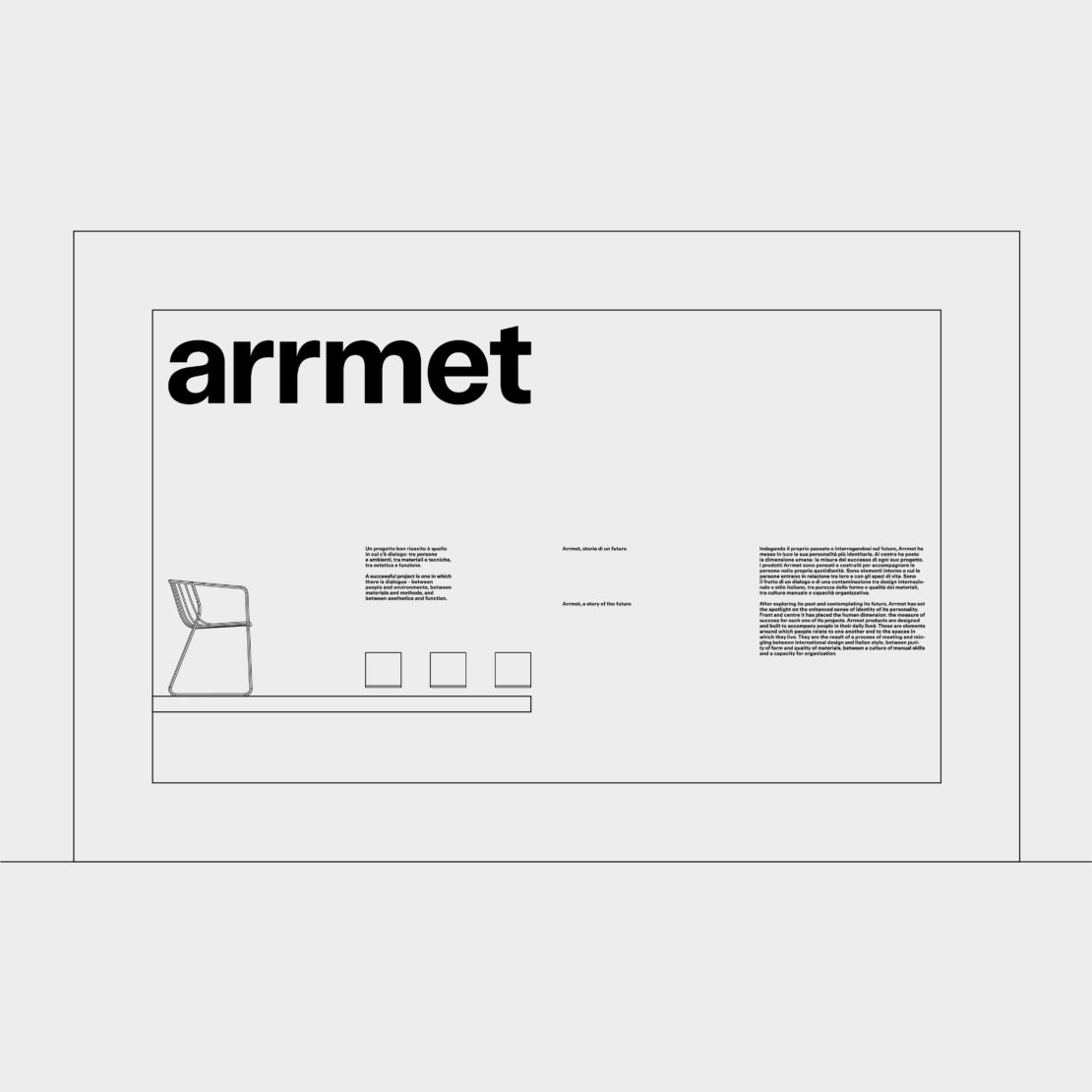
Arrmet has a long history behind it and has established itself as an international brand through a number of collections that have become contemporary classics. Its sustainable design, which stands the test of time and use and brings people together, is based on the simplicity of well-designed projects, those in which there is dialogue: between people and environments, materials and techniques, aesthetics and function.
The rebranding marks a new chapter in Arrmet’s history. after a year of reflection during which the company management and art direction focussed on defining the personality that best suits Arrmet’s identity.
This renewed image is consistent with its appealing style, expressed through ideas and impeccable workmanship, a culture of craftsmanship combined with the ability to organise, the purity of the forms and the quality of the materials of Made in Arrmet products.
The colours of Arrmet
The new personality of the brand includes a palette of primary colours and the new typeface called Arrmet Grotesk. The choice to animate communication through colour came by simply looking at the Company’s past: colour has always played an important role in Arrmet’s world.
“Colour reflects the energy and vitality that Arrmet puts into its products. Therefore, the use of a broad range of colours for the palette seemed to us the right choice, and is wholly consistent with the Company’s DNA,” the Company asserted. “We wanted to create an identity that set us apart from the monochromatic codes and expressed Arrmet’s personality and character, by creating a language that was visually attractive, usable and original.”
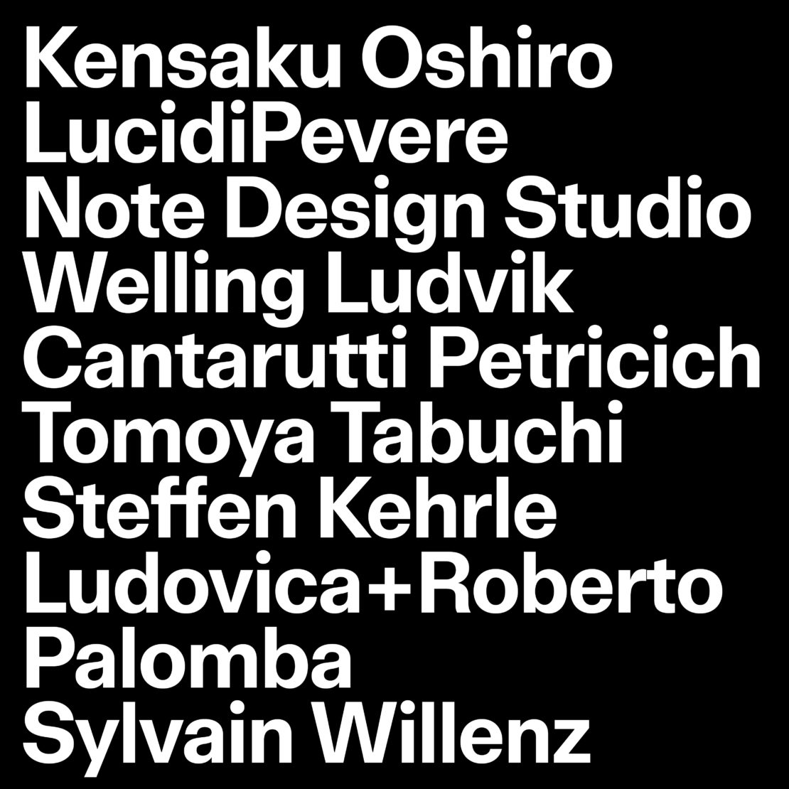
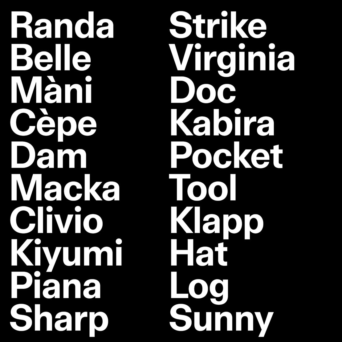
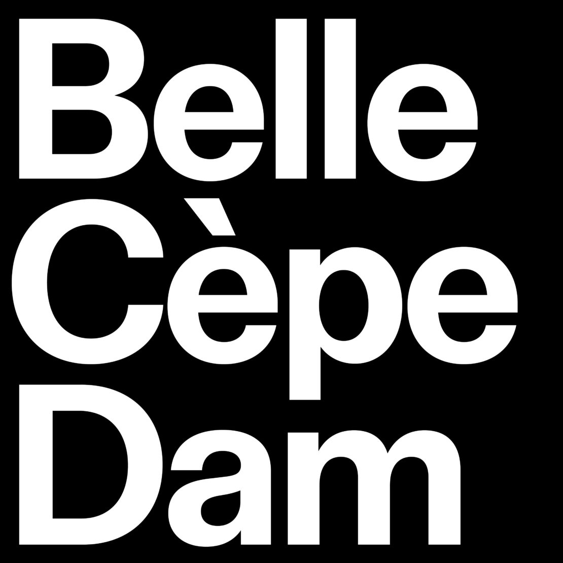
Arrmet Grotesk
The new typeface is a sans-serif font, the result of meticulous formal research into the modern grotesque style, with a particular emphasis on Italian tradition in the genre.
The compact proportions and low contrast enhance its usability without compromising on its formal elegance, while the number of glyphs makes it versatile and suited to a variety of uses. The great examples from which Arrmet Grotesk drew inspiration are Linea by Umberto Fenocchio and Forma by Aldo Novarese, both of which show significant clarity and sharpness.
Arrmet Grotesk features a customised stylistic set with round punctuation and a peculiar design for the letters ‘t’, ‘Q’ and ‘R’. This typeface pays tribute to the geometric language of design, imbued with that inimitable mix of know-how, imagination, creativity, luxury and versatility that the whole world identifies with Italian style.